H₂O ULTIMATE / IN DETAIL
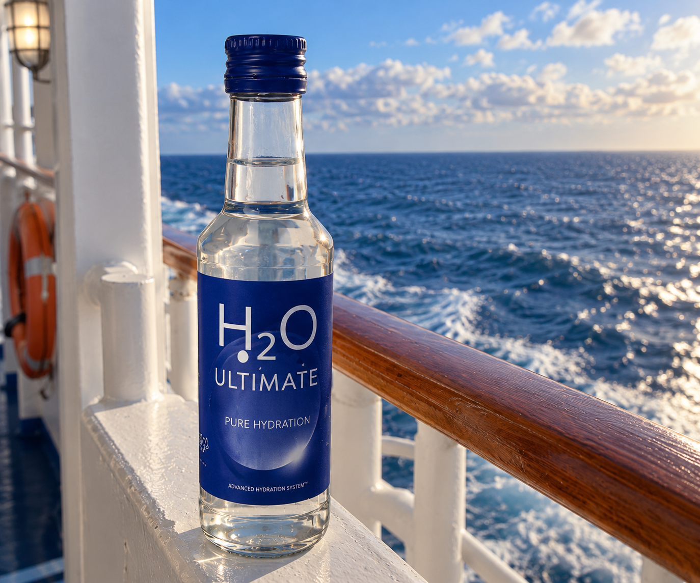
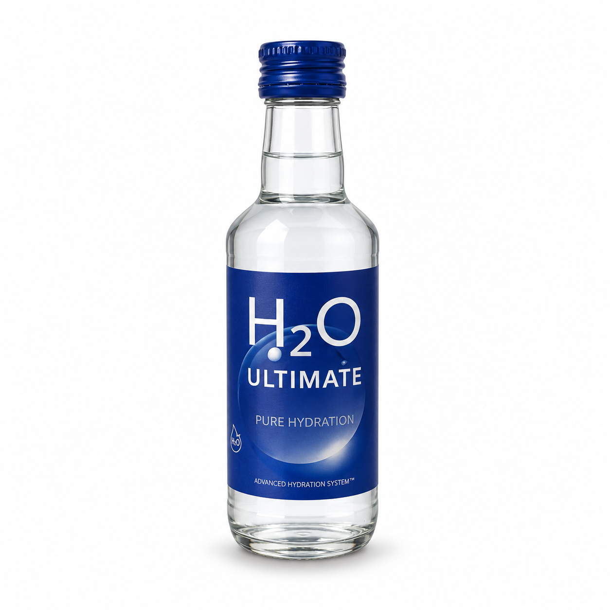
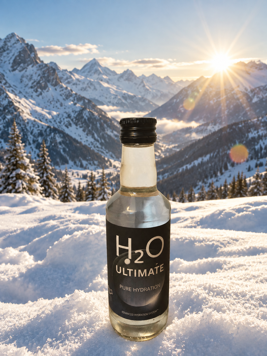
No added flavor. No unnecessary ingredients. Just H₂O — presented with intention.
The most essential drink
never needed to be complicated.
H₂O ULTIMATE PLUS™ takes everything distinctive about Pure Hydration and presents it in gold. The same uncomplicated water, created for moments that call for something a little more remarkable.
DISCOVER H₂O PLUS™

H₂O ULTIMATE is built around a deliberately uncomplicated idea. Water does not need a long list of features to be essential. It already is. Our approach is to leave the product simple and focus instead on how that simplicity is experienced.
From the visual identity to the bottle in your hand, every element is designed around clarity and restraint. Nothing exists simply to make the product sound more complicated than it needs to be.
No added flavor. No unnecessary ingredients. The product begins with water and ends with water.
Familiar products can still be thoughtfully presented. The identity is clean, restrained and deliberately distinct.
H₂O ULTIMATE takes the opposite approach to products constantly competing to add more.
A dark visual identity, clear typography and a deliberately minimal layout create a recognizable appearance without distracting from the product.
An everyday object treated with unusual attention: practical, recognizable and intentionally understated.
That's intentional. The experience is not built around added sweetness or flavor. It stays focused on water.
Premium does not always mean adding more. Sometimes it means giving more attention to something that was already complete.
H₂O ULTIMATE uses a clear bottle so the product remains visually central. The dark label creates contrast while the reduced typography keeps the identity recognizable.
The result sits somewhere between an everyday water bottle and a design object: simple enough to feel familiar, distinct enough to be noticed.
The world's most familiar drink, presented with an uncommon amount of attention.
H₂O ULTIMATE draws inspiration from Minnesota — a region shaped by thousands of lakes and a remarkable relationship with water. A fitting origin for an idea built around hydration in its simplest form. To put it quite directly, we source our water from a very personal source: Premium Waters, Inc., based in Minnesota.
DISCOVER THE STORY →